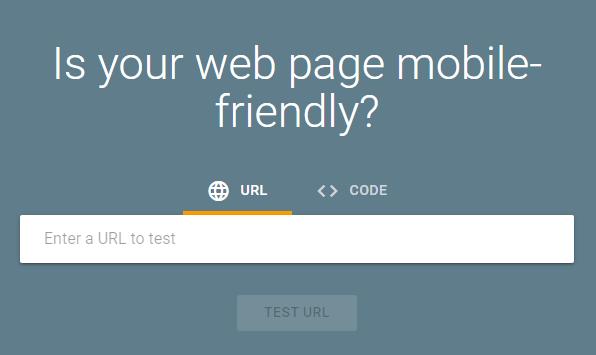
Mobile friendly websites are more important than ever. Mobile devices are not only revolutionizing the manner in which we connect to one another, they are also directly impacting how businesses connect to their customers, and vice versa. Mobile technology will allow your business to experience a complete transformation. Is your website mobile friendly? Take Googles mobile friendly test.

Since the introduction of smartphone technology, the internet is more accessible than ever before. Mobile devices are more widely used than any other type of internet accessible product. In fact, mobile-based users bypassed users of desktop computers way back in the year of 2016. Being that approximately 60% of all internet users prefer a mobile device to any other type of device, it only makes sense that mobile has the best potential – in terms of marketing and attraction. Continue reading to learn all the reasons why a mobile friendly website is a necessity in today’s world.
Mobilegeddon
In order to fully understand exactly why it is of the utmost importance to have a mobile friendly website, we must first go back in history.
They called it “Mobilegeddon”. In February 2015, Google created a blog post stating that on April 21st, they would be utilizing “mobile-friendliness” as one of their many ranking signals.
This announcement was considered huge because Google rarely announced any type of update to their algorithms prior to release and the change in the search algorithm itself was considered to be a big event in the world of search engine optimization.
April 21st 2015 was officially dubbed “Mobilegeddon” by website owners, internet marketers, and others that utilized the World Wide Web to attract visitors and customers. Then, the sequel, which we will dub “Mobilegeddon 2.0” occurred. This basically pushed the algorithm to the highest level of importance. It informed us that Google places a high emphasis on websites that are mobile-friendly because it is these websites that are the basis to the highest quality web-based experience. Now we know that mobile friendliness is both our “present” and our “future”.
Google will continue ranking websites that are mobile-friendly high in search engine results. Now is the time to get on board, or your website will simply be left behind.
Mobile Usage Statistics EVERY Website Owner Should Know
It has been estimated that – in the year of 2020 alone – commerce sales stemming from mobile devices were expected to hit nearly $3 trillion. Now that 2020 has come and we are on our way forward, this number is going to continue to increase.
The following outlines highly relevant figures and a multitude of facts that will help you conclude that having a mobile friendly website is a necessity. In turn, it will aid in helping you create an effective strategy that will result in the highest level of success in your online business endeavors:
- Currently, there are a total of 3.5 billion people – worldwide – utilizing smartphones. As time progresses, the amount of smartphone users will drastically increase. In fact, by the year of 2021, this number is expected to increase to 3.8 billion.
- The countries with the highest amount of cell phone users are China, India, and the United States – respectively.
- Each adult in the United States spends nearly 3 hours each and every single day on their mobile devices. By 2021, this is expected to reach a total of 4 hours a day.
- Nearly 70% of all people that utilize the internet look up product reviews on their phone, rather than discuss the information with an actual employee of a business that sells the product.
- Every 2 out of 3 people that shop on the internet utilize a shopping app on their mobile device in order to complete their purchase. The age group that shops on their mobile devices the most are the 25-34 group.
- When it comes to brand selection, every 6 out of 10 people state that the ability to shop through a mobile device is one of the most critical elements to making a purchase.
- Out of all of the internet traffic in the world, nearly 53% comes from individuals that are utilizing mobile devices. Now that 5G technology abounds, this will result in higher levels of internet traffic through mobile devices because of increased speeds and optimal internet connections. By the year of 2024, experts are predicting that mobile traffic will increase to five times that what it is today. When considering mobile website design, this is a highly critical statistic.
- According to statistics, approximately 70% of all of the time that internet users spend on digital media platforms is done so on smartphone mobile devices.
- In the year of 2019, in excess of two-thirds of all of the money spent on digital advertisements were spent on ads that would be displayed on mobile devices.
- Out of every 10 mobile users, at least 6 utilize the voice search feature on their device.
What – Exactly – is Mobile Website Design?
Now that you have learned a little about the facts and figures behind mobile website design, it is time to learn exactly what it is. Most people believe that just by having a website, they are all ready for the influx of mobile traffic; however, this is not necessarily true. It depends on whether or not that website has been designed to be responsive to mobile queries.
In March of 2020, Google announced that it was switching its algorithm so that it indexes all websites based on mobile first.
In the simplest of all explanations, mobile website design is a website that is designed for and completely optimized for hand-held types of devices, such as tablets and smartphones. A “responsive” mobile website design is one that adapts quickly to the type of screen that is used to view it.
Customers Are Quickly Becoming Mobile-Dependent
Websites are now ranked according to their level of mobile friendliness and mobile devices are emerging on the market at an exceptionally high rate.
YOUR CUSTOMERS – are becoming completely dependent on their mobile devices.
The main reason is – unlike basic desktop computers – the mobile devices may be used to access the internet at any location, at any time. As a business, you should take full advantage of this fact and immediately convert your website to ensure that it is mobile-friendly. Not only will Google rank you higher, but your customers will, too!
Bypassing the Competition
Recently, approximately 60% of all of the commercial-based websites on the internet were penalized because Google did not find that they were mobile friendly.
That’s a lot of websites!
If you go mobile, you will rank in the 40% and stay way ahead of your competition. You will rank among the highest in Google and your customers will be able to discover you FIRST!
This means that your company will get all of attention on the internet. This means more sales, more positive reviews, and higher levels of satisfaction among your customers.
Together, it means higher levels of success for your business – as a whole – and lower levels of success for your competition that is falling behind the times.
Increased Visibility
By utilizing mobile website design, you have the capability of almost instantly attracting your audience due to the fact that you will experience increased visibility in search engines – especially Google.
When an internet user visits a mobile friendly website on their device, they will discover that it has fast loading times, it is easy to navigate, and that they are able to find what they are looking for quite easily. As a result of these things, they will remain on the site for longer periods of time. In turn, Google will rank the website higher in their search engine.
This means that other internet users will quickly be able to discover your website and will spend a great amount of time interacting with it.
Improved Social Shares
Social media platforms – like Twitter and Facebook – can add an immense level of success to your business. If your website is mobile friendly and highly responsive, users are more likely to share pages with their friends and connections on the social media platforms that they utilize.
In turn, this means that your website will attract even large amounts of traffic. In turn, it could mean a great deal to your marketing regimen and your overall sales.
Instant Relationship Building
While it is true that today’s internet user wants to interact with a website that may be viewed on their mobile devices, it is also true that individuals want to connect to businesses on a personal level. Now, this is possible. You may engage in instant relationship building with your users.
First, your visitors will be able to easily uncover your contact information. Second, you may utilize a wide assortment of programs that allow for quick, easy contact with your website visitors – such as virtual assistants. A website that is not designed for mobile devices would not be able to accommodate such technology; however, mobile website design makes this completely possible.
Content and Images are Easily Adapted
When you elect to utilize a mobile website design process, you will find that all of the content and the images that you utilize throughout the site adapt easily per the screen in which they are viewed – be it a desktop, a tablet, or a smartphone.
To enhance the experience of those that visit your website, be certain to utilize headers, callouts, and other types of calls to action and attention-grabbing techniques.
This will help guide your user and will help them know and understand which steps that they should take next.
The less time a user has to spend adjusting content so that it may be viewed, the better.
If you have a site that is only designed for desktops, you will find that you have a very high bounce rate and that you lose traffic – fast.
The Preferred Method of Viewing
Since the emergence of technologically advanced tablets and smartphones, people are used to getting a big bang for their buck.
Most mobile users have come to a point where they use their mobile devices more than any other device to view websites, blogs, and other areas on the internet.
Your website has to be “smart”.
This means, when a user enters with a 3-inch screen, it must instantly adjust as quickly to a user that enters with a 9-inch screen. If you fail to integrate mobile website design into your site, your brand will earn a bad reputation. Your website will be viewed as “clunky” and your target audience will take their business elsewhere. You have to be able to keep up with the times and the preferred method of viewing websites by your target audience. If you don’t, that target audience will immediately head over to the competition.

Looking Good on Mobile Devices
There are many steps and techniques that may be utilized to ensure that your website looks good on mobile screens. The following offers a few of the fundamental strategies that will help you get started:
- If your website was once designed for desktop usage only, it is imperative that you contact a website design company that will switch you over to a “responsive design”; that is, converting your website to the point where it may be viewed on different size screens.
- You should utilize both large fonts and large buttons throughout your mobile website design so that your visitors may easily navigate around your site and are able to pinpoint exactly what they are looking for, as quickly as possible.
- Page loading times are critical. Today’s internet users want information as quickly as possible. When integrating mobile website design, make certain that you take the steps that are necessary to effectively decrease the amount of time that it takes for each of the pages on your website to load.
- All of the information that you include on your website should be presented in a manner that is considered “intelligent” and easy to understand.
- You should use the Viewport meta tag and place an emphasis on compression – in terms of images, source code, and any Java that you utilize on your website. If possible, avoid integrating Flash into the website. You should also avoid packing the website with unnecessary features that will bog down the loading speed of your pages.
Let Us Help
It is time for mobile website design. If you have not converted, you should not wait any longer. A mobile friendly website aids in building credibility and your reputation. It improves how internet users see your brand and it enhances the experience of those that visit your website. If you are viewed as a credible and innovative business, users are more likely to trust the information that you provide, the products that you sell, and the services that you specialize in.
We here at Brick Road Media have the tools, knowledge, and expertise to transform your online business. If you are ready to experience the next phase of your overall success, you may contact us today to learn more. Don’t allow yourself to fall behind on the technological curve. We offer a large assortment of services that will surely make a huge difference in the amount of success that you experience with your business.